Annual reports carry some of the most important work an organisation does.
They show where funding went. They explain what changed. They document the people reached, the projects delivered, the partnerships built, and the lessons learned.
But in many organisations, the annual report still ends up as a long PDF.
A carefully written document. A beautiful cover. Strong photos. Dozens of pages. Then it is emailed to stakeholders, uploaded to the website, shared once or twice, and quietly archived.
That is not because the work is unimportant.
It is because the format often asks too much of the reader.
Donors are busy. Board members are reviewing many documents. Partners want the highlights quickly. Public audiences may not have the patience to read through a full institutional report. And for organisations working across communities, field sites, research locations, schools, farms, clinics, cultural spaces, or development projects, a static document can struggle to carry the full weight of the story.
This is why more NGOs, non-profits, research institutions, foundations, and development organisations are looking for more creative ways to present annual reports to stakeholders.
Not louder. Not flashier.
Clearer. Richer. Easier to explore.
At DOBIISON, we help organisations turn reports, field stories, project documentation, and stakeholder communication into interactive digital experiences. Through our enterprise services, we build platforms using 360° media, virtual tours, maps, videos, hotspots, narration, embedded documents, and web-based storytelling.
The aim is simple: help people understand the work better.
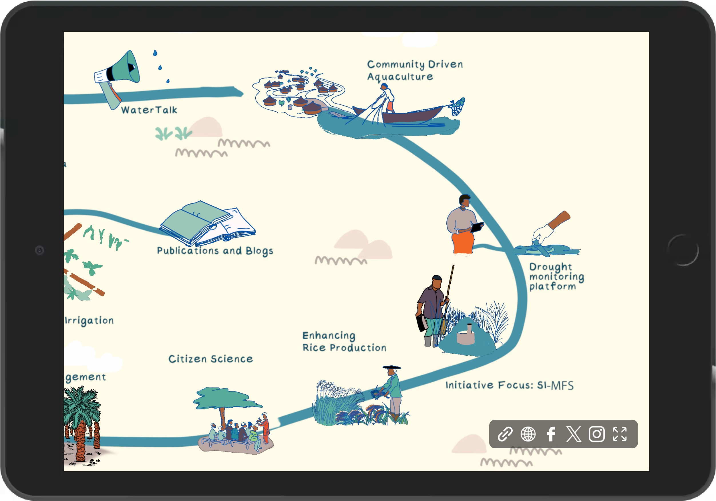
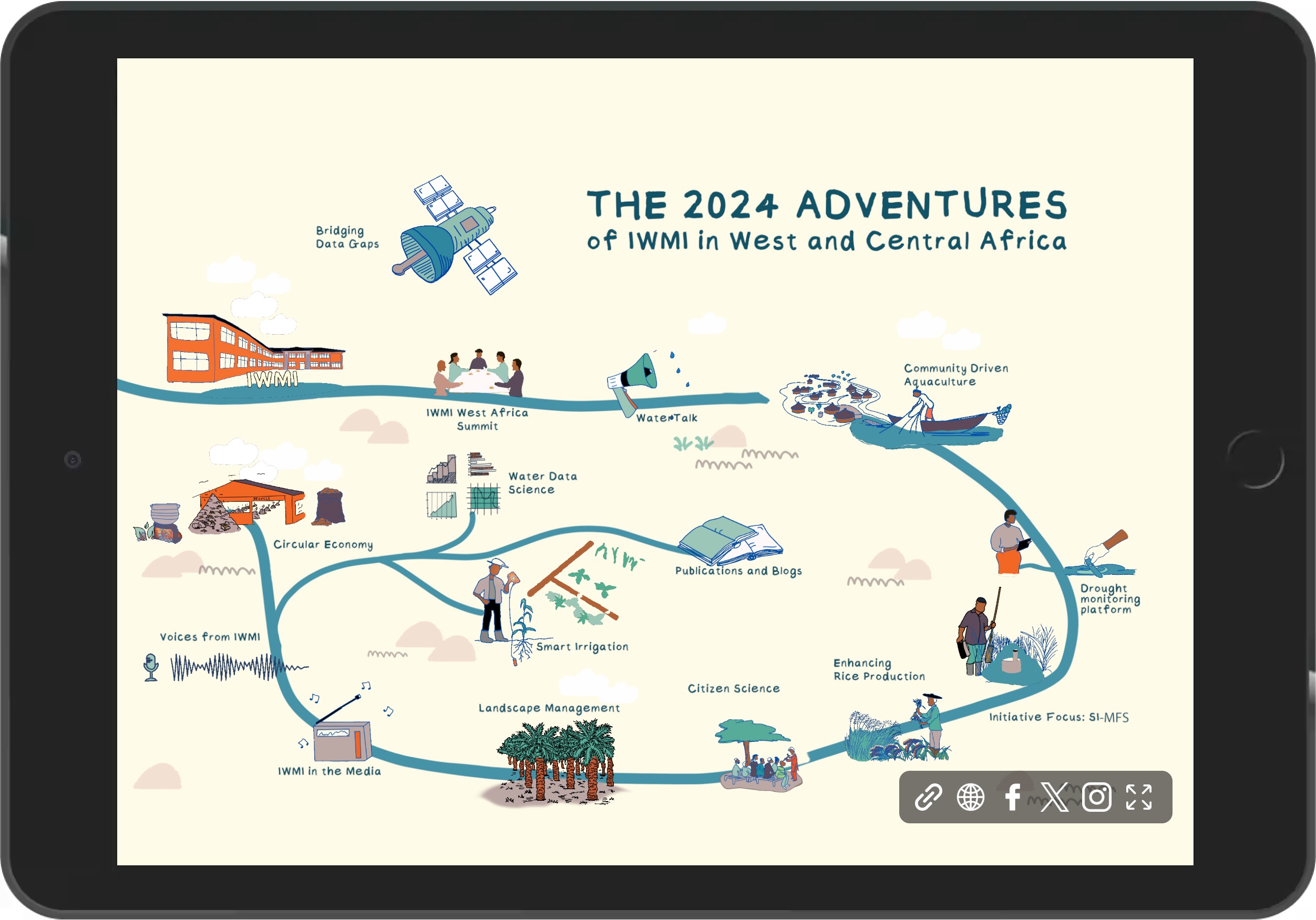
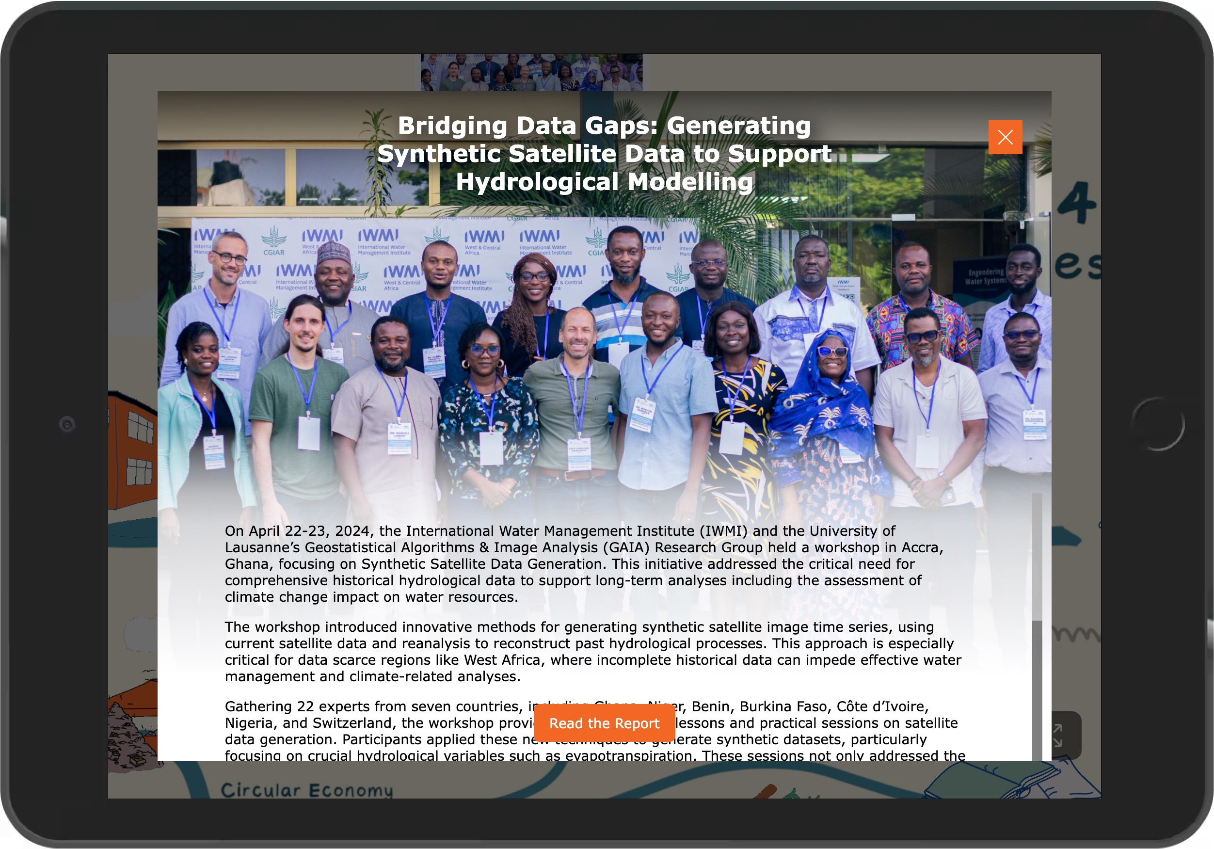
You can see examples of this approach in DOBIISON’s IWMI/WCA interactive experience and the ILRI/OHRECA interactive journey.
Both show how institutional work can move beyond flat pages and become something stakeholders can enter, follow, and remember.
What Is an Interactive Annual Report?
An interactive annual report is a digital version of an annual report designed for exploration.
It may live on your website, as a standalone microsite, or as a private link shared with donors, board members, partners, and stakeholders.
Instead of asking people to read page after page, it lets them navigate the report more naturally.
They can click into programme areas. Explore project locations. Watch short videos. Open photo stories. Listen to narration. View timelines. Read impact highlights. Download supporting documents. Move between sections based on what matters most to them.
The report still does its serious job.
It still documents achievements, finances, partnerships, results, and priorities.
But it presents the information in a way that feels closer to how people now engage with information online.
An interactive annual report can include:
A message from leadership
Programme highlights
Interactive maps
360° virtual tours of project sites
Short videos from staff, partners, or communities
Photo-led impact stories
Milestone timelines
Key results and data highlights
Donor and partner recognition
Downloadable PDFs
Embedded publications
Contact or enquiry forms
Analytics to see how stakeholders engage
The goal is not decoration.
The goal is clarity, access, and stronger stakeholder engagement.
Why Traditional Annual Reports Often Fall Short
A traditional annual report is still useful. In many cases, it is required.
But it is not always the best format for helping people understand complex work.
This is especially true for organisations working in areas such as agriculture, water, health, education, climate resilience, food systems, gender inclusion, youth development, culture, conservation, public policy, and community development.
These stories need context.
A paragraph can explain that a programme supported farmers.
A chart can show the number of participants reached.
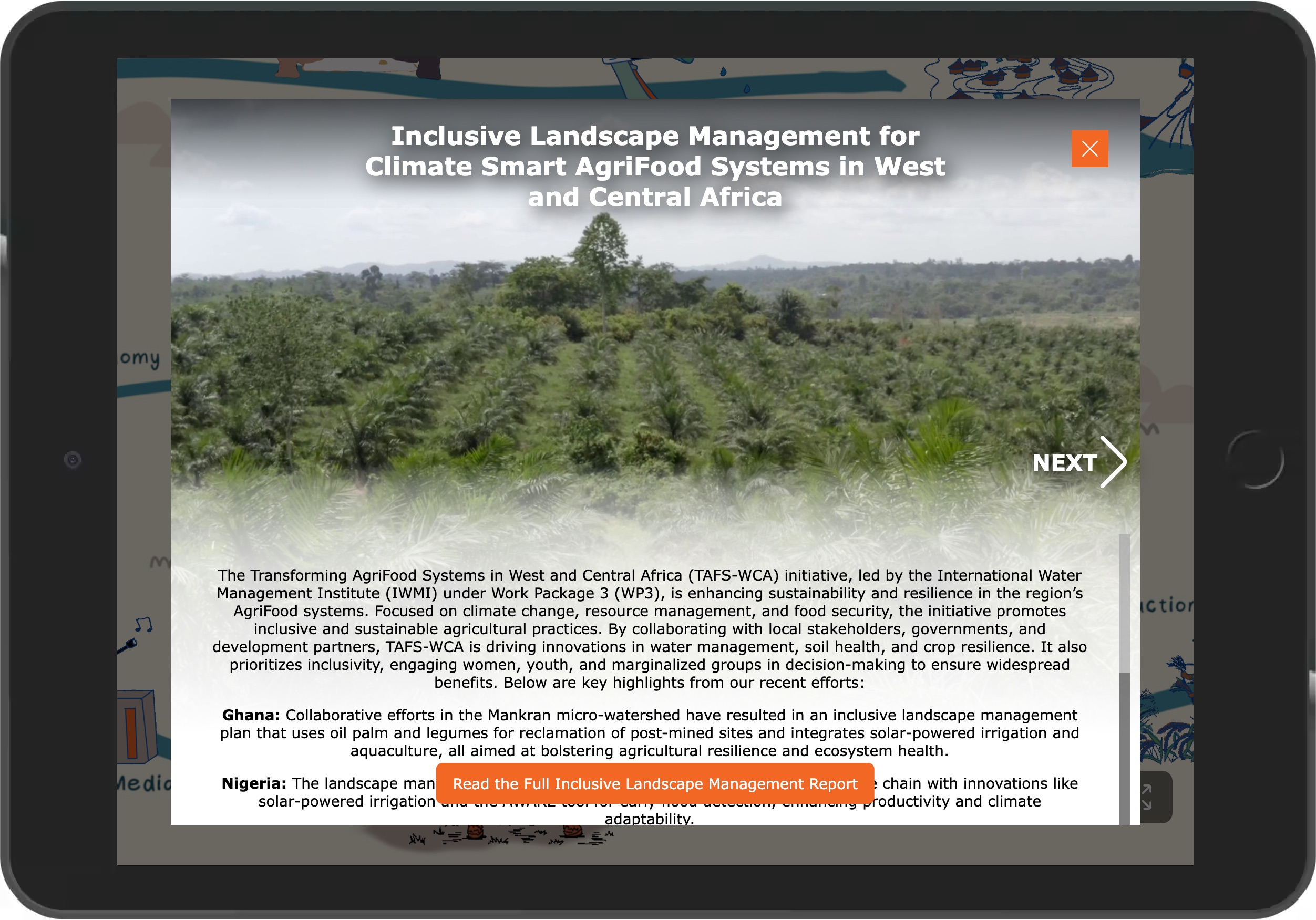
But a richer digital experience can show the project site, introduce the people involved, place the work on a map, share a short field video, and connect the activity to the wider programme goal.
That matters because many stakeholders will never visit the project locations themselves.
A donor in Europe may be reviewing work carried out in West Africa.
A board member may need to understand activities across several countries.
A partner may want to see what happened on the ground without waiting for a physical visit.
A public audience may need a simpler way to understand why the work matters.
An interactive annual report helps close that distance.
It gives the work a stronger digital presence.
A Better Way to Present Impact to Donors and Stakeholders
For NGOs and development organisations, reporting is not only about compliance.
It is about trust.
Stakeholders want to know what was done, where it happened, who benefited, what evidence supports the results, and what comes next.
An interactive annual report can make those answers easier to find.
Instead of placing all audiences inside a single long PDF, the report can guide different users to the content most relevant to them.
A donor can go straight to funded projects and outcomes.
A board member can review strategic priorities and annual progress.
A partner can explore programme areas and shared achievements.
A journalist can find photos, summaries, and public-facing stories.
A new staff member can use the report to understand the organisation’s work.
A community stakeholder can see how their story fits into the wider mission.
That is the strength of an interactive format.
It respects people’s time without reducing the depth of the work.
Creative Annual Report Ideas for NGOs and Non-Profits
There are many ways to make an annual report more engaging without making it feel gimmicky.
The best approach depends on your audience, your content, your budget, and the kind of work you need to present.
Here are some of the strongest formats DOBIISON can help organisations build.
1. Turn the Annual Report Into a Digital Microsite
A digital annual report microsite gives your report a proper online home.
Instead of uploading a PDF and hoping people download it, you create a structured web experience around the year’s work.
A microsite can include the executive summary, leadership message, programme sections, impact numbers, videos, project stories, financial highlights, partner acknowledgements, and downloadable documents.
This works well for organisations that want their annual report to be easy to share with donors, partners, government agencies, board members, media, and the public.
It also makes the report easier to find online.
A PDF can disappear into a website folder. A digital report can become part of your organisation’s public story.
2. Add 360° Virtual Tours of Project Sites
For organisations whose work happens in real places, 360° virtual tours can make the report much stronger.
A virtual tour allows stakeholders to explore a location from their phone, laptop, tablet, or headset.
This could be a research station, farm, water facility, health centre, school, training site, community hub, cultural location, conservation area, laboratory, exhibition space, or field office.
Inside the tour, users can click on points of interest to open text, images, video, audio, documents, or project data.
This is especially useful when physical site visits are expensive, difficult, or limited to a few people.
A virtual project visit does not replace being there in person.
But it gives stakeholders a much better sense of place than a paragraph or still image can provide.
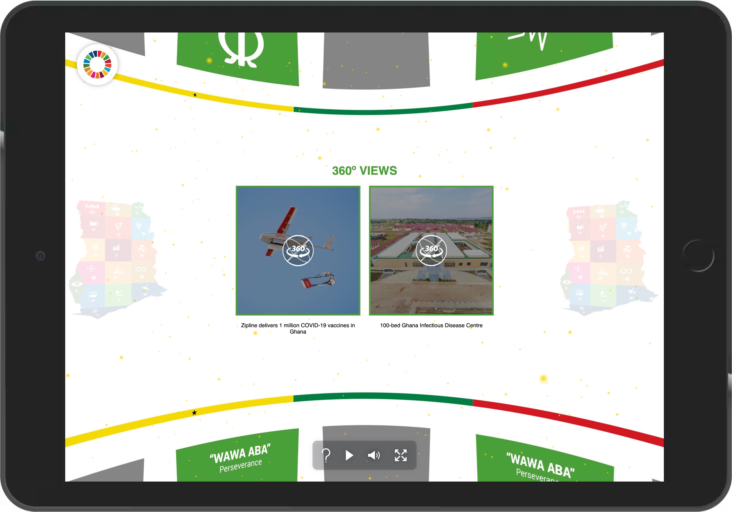
The IWMI/WCA interactive experience is a strong example of how institutional spaces and project information can be presented in a way people can explore directly from their browser.
3. Use Interactive Maps to Show Where Work Happened
Many NGOs and development organisations work across multiple regions, countries, districts, or communities.
A static list of locations can feel flat.
An interactive map helps stakeholders see reach and scale quickly.
Users can click on a country, region, district, or site to view related programmes, photos, results, partner information, field notes, publications, or videos.
This is valuable for multi-country programmes, regional research initiatives, donor-funded projects, public health campaigns, education programmes, and community development work.
It helps people understand not only what happened, but where it happened.
That geographic context can make a report far more useful.
4. Tell Impact Stories With Video, Audio, and Photography
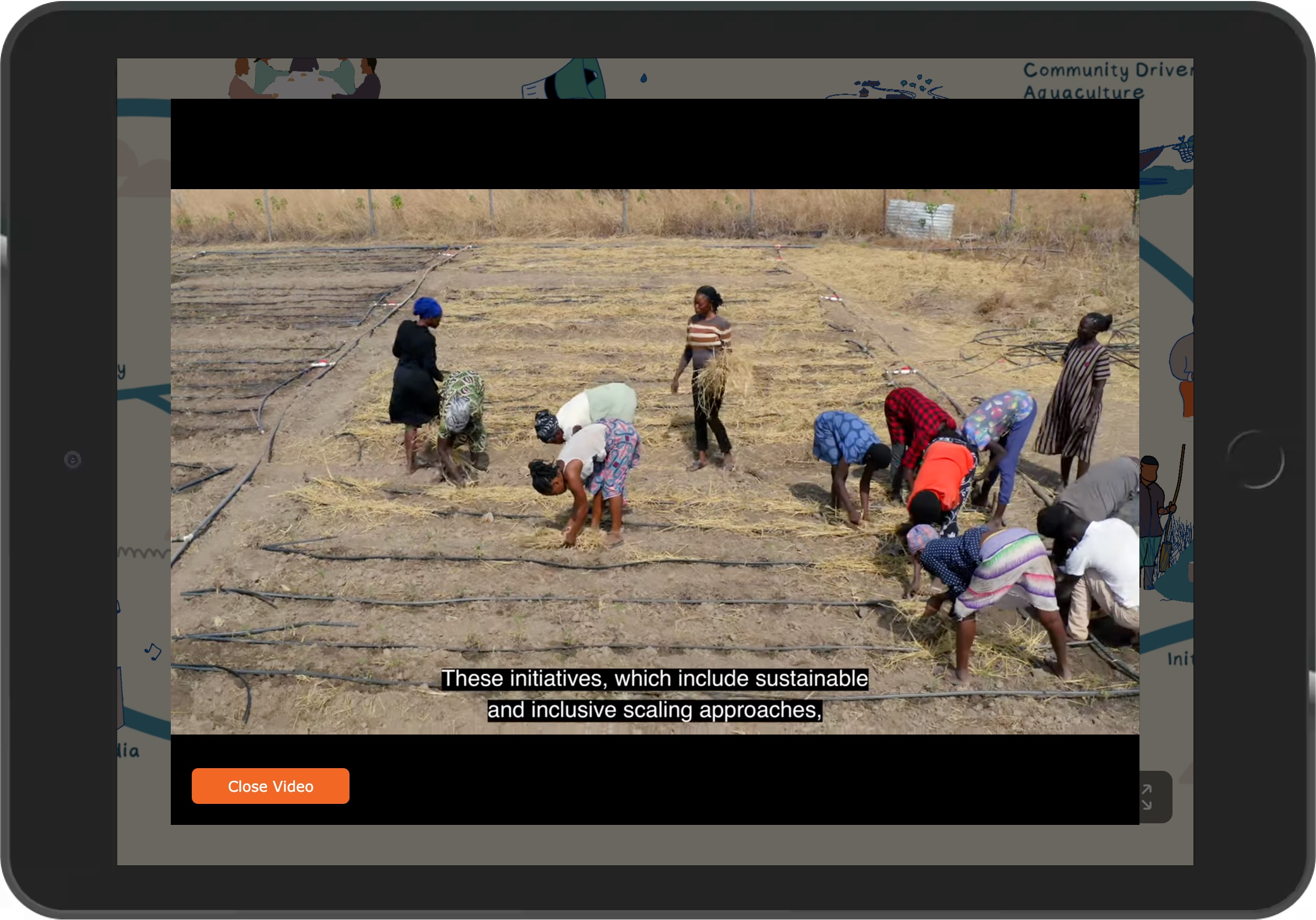
Annual reports often include strong stories, but they are usually compressed into short case studies.
An interactive report gives those stories more room.
A beneficiary story can include a short video, portrait photography, audio, written context, field images, and a clear link to the programme outcome.
A staff reflection can sit beside project data.
A partner quote can be supported by images from the field.
A community story can be placed on a map, connected to a timeline, and supported with documents or related media.
This helps stakeholders feel the human side of the work without losing the evidence.
For many non-profits, this balance is important.
The report must be credible, but it should not feel lifeless.
5. Build a Donor Reporting Platform
Some organisations need more than a public annual report.
They need a structured reporting experience for funders, boards, and institutional partners.
A donor reporting platform can organise information by donor, programme, country, funding area, outcome, or strategic priority.
It can include project summaries, financial highlights, evidence, media, maps, and downloadable documents.
This gives your team a stronger tool for donor meetings, board presentations, funding reviews, and partnership conversations.
It can also reduce the pressure on teams to keep recreating presentation materials from scratch.
The report becomes a living communication asset, not a one-time file.
6. Create a Timeline of the Year
A timeline is one of the simplest ways to make an annual report easier to follow.
It can show project launches, field activities, research milestones, community engagements, publications, events, policy moments, training sessions, and major achievements across the year.
This helps stakeholders see progress.
It also gives the report a sense of movement.
Rather than reading a list of activities, users can follow the organisation’s year as it unfolded.
7. Present Research and Technical Work More Clearly
Research organisations and technical programmes often face a specific challenge.
The work is important, but it can be difficult for non-technical audiences to understand quickly.
An interactive report can help translate complex material without oversimplifying it.
Research findings can be supported with diagrams, short explainers, maps, videos, field documentation, and links to full publications.
Users who want the summary can get it quickly.
Users who want the full evidence can go deeper.
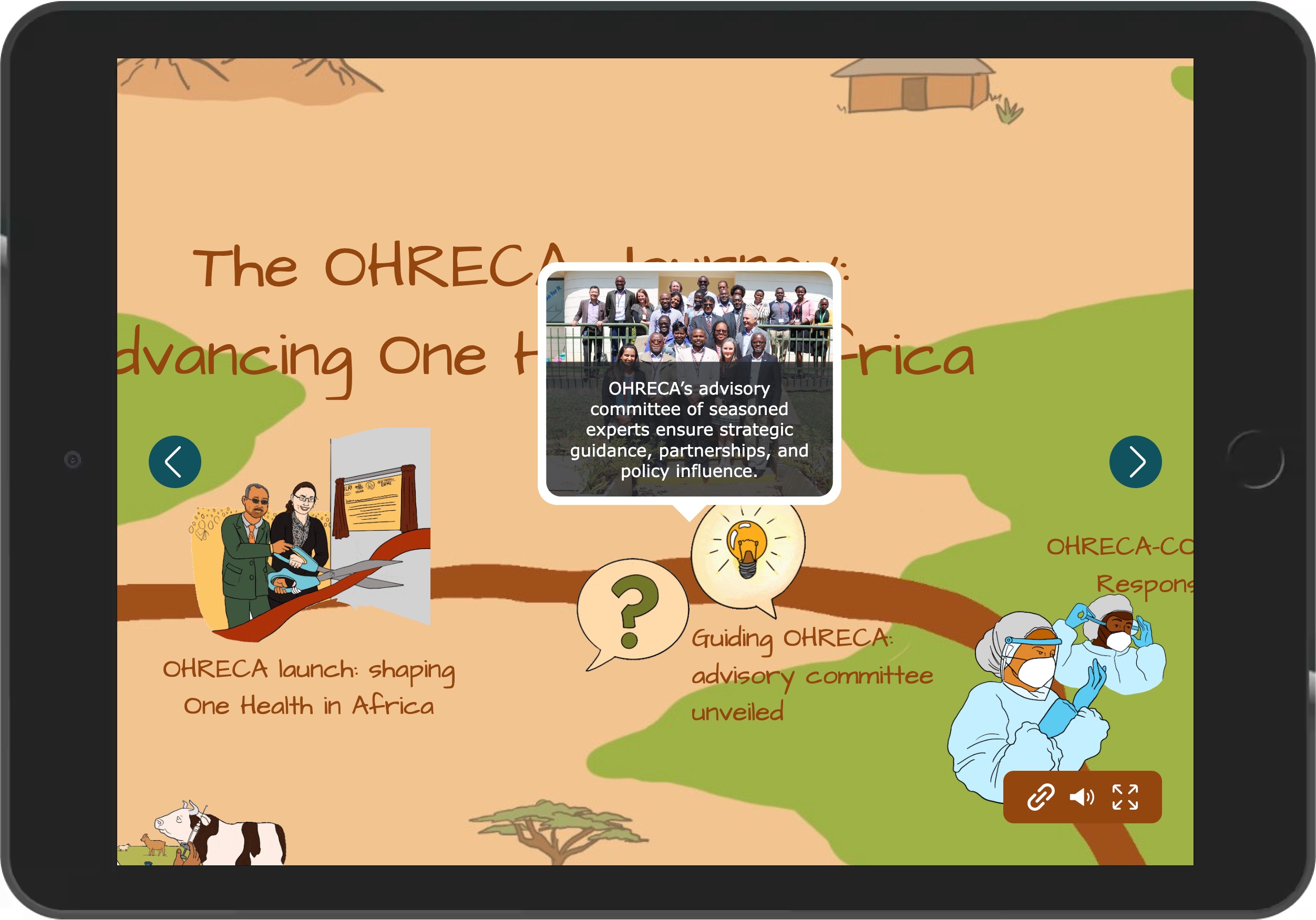
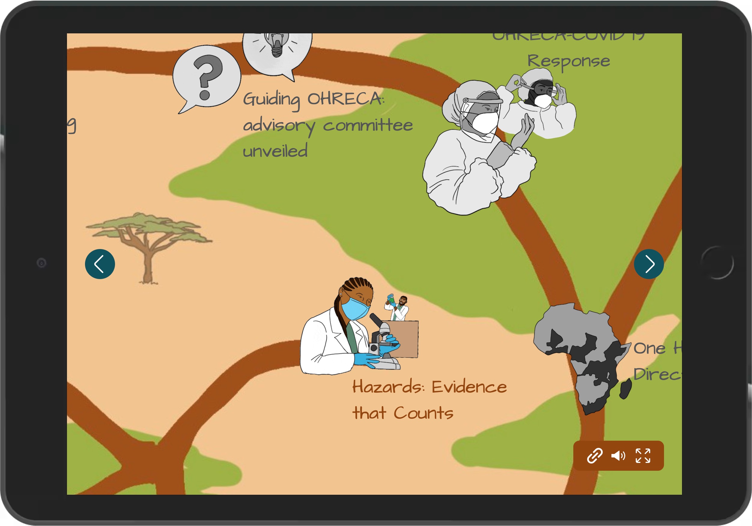
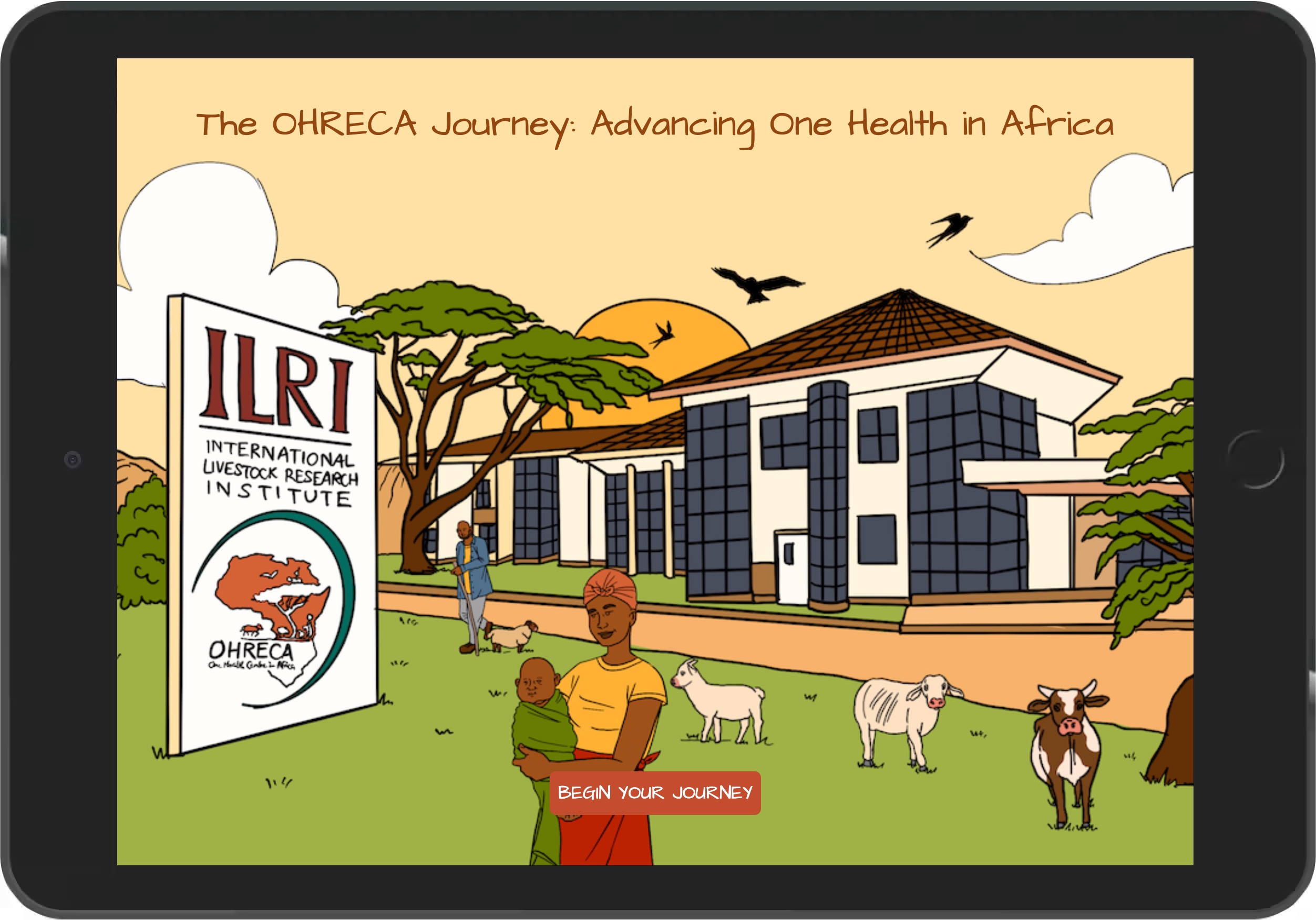
The ILRI/OHRECA interactive journey is a useful reference for this kind of work. It shows how years of programme activity, research, partnerships, and institutional memory can be organised into a digital experience stakeholders can explore.
That is especially valuable when a programme has a long history, many collaborators, and a story that cannot be captured properly on one page.
How DOBIISON Builds Interactive Annual Reports
DOBIISON works with organisations that need to communicate serious work in a more accessible way.
We can begin with what you already have: a draft annual report, Google Doc, Word document, PDF, field photos, videos, project summaries, publications, data, or stakeholder brief.
From there, we help shape the right format.
Depending on the project, DOBIISON can support with:
Digital report strategy
Story structure
Interactive web design
360° media capture
Virtual tour production
Video and photography
Interactive maps
Hotspots and navigation
Report content adaptation
Embedded documents and media
Hosting and deployment
Analytics setup
The process is practical.
We look at who the report is for, what they need to understand, what content already exists, what media needs to be created, and how the final experience should be shared.
Some organisations need a full interactive annual report.
Some need a virtual tour linked to their report.
Some need a donor-facing impact platform.
Some need a project story microsite.
The format should always serve the message.
Who This Is For
Interactive annual reports are useful for organisations that need to show impact, build trust, and make complex work easier to understand.
This includes:
NGOs
Non-profits
Development organisations
Research institutions
Foundations
Donor-funded programmes
Universities and schools
Cultural institutions
Government agencies
Public sector programmes
Climate and sustainability projects
Agriculture and food systems programmes
Public health initiatives
Education and youth development programmes
Heritage and tourism bodies
If your work involves people, places, field activity, research, funding, public accountability, or long-term impact, an interactive report can help stakeholders engage with it more fully.
Why Work With DOBIISON?
DOBIISON is an immersive technology company based in Accra, Ghana.
We build digital systems that help real-world places, projects, stories, and experiences become easier to explore, understand, and access from anywhere.
For enterprise, NGO, institutional, and development-sector clients, our work sits between communication, technology, documentation, and experience design.
We are not only making things look attractive.
We are helping organisations present work that deserves to be understood.
That includes annual reports, project documentation, donor communication, stakeholder engagement platforms, virtual field visits, institutional storytelling, and interactive learning experiences.
Our work with platforms such as the IWMI/WCA interactive experience and the ILRI/OHRECA interactive journey shows how reports, spaces, stories, and institutional knowledge can be presented in a format people can actually spend time with.
Your Annual Report Can Do More Than Report
A good annual report records what happened.
A better annual report helps people understand why it mattered.
For NGOs, non-profits, research institutions, and development organisations, that difference is important.
Your report can support donor confidence.
It can help partners see the value of collaboration.
It can give board members a clearer view of progress.
It can make field work visible to people who may never visit the field.
It can preserve stories that would otherwise be reduced to a few paragraphs.
It can become a tool your team uses throughout the year, not just something you publish once.
That is the real value of an interactive annual report.
It gives your work more room to be seen, understood, and remembered.
Build an Interactive Annual Report With DOBIISON
Looking for a creative way to present your annual report to stakeholders?
DOBIISON helps NGOs, non-profits, research institutions, foundations, development organisations, cultural bodies, and enterprise teams create interactive annual reports, virtual project tours, donor reporting platforms, and digital impact storytelling experiences.
Whether your report is still in draft form or already written, we can help you shape it into a digital experience that is clear, credible, and built for the people who matter most to your organisation.
Explore related work:
View the IWMI/WCA interactive experience
View the ILRI/OHRECA interactive journey
Speak to DOBIISON about building an interactive annual report, virtual project tour, or stakeholder reporting platform for your organisation.